.jpg)
In the home of an architect and creative director, nothing is accidental. From the choice of the house itself to the chairs you sit on and the cups you drink from, everything exudes a passion for design and an eye for aesthetics.
Soon, Dieter and Ward will have been living in their Brussels flat for 20 years, located between the city centre and the North Quarter. The building still looks surprisingly modern, thanks to architect Eugeen Liebaut's choice of clarity, livability and functionality. With glass facades and open living spaces, he set a new standard in this neighbourhood undergoing change.
"We very consciously chose to live here. The open living and kitchen space, combined with smaller, more intimate rooms for other functions, creates a fine balance. The flats in the building are very livable thanks to those choices."
.jpg)
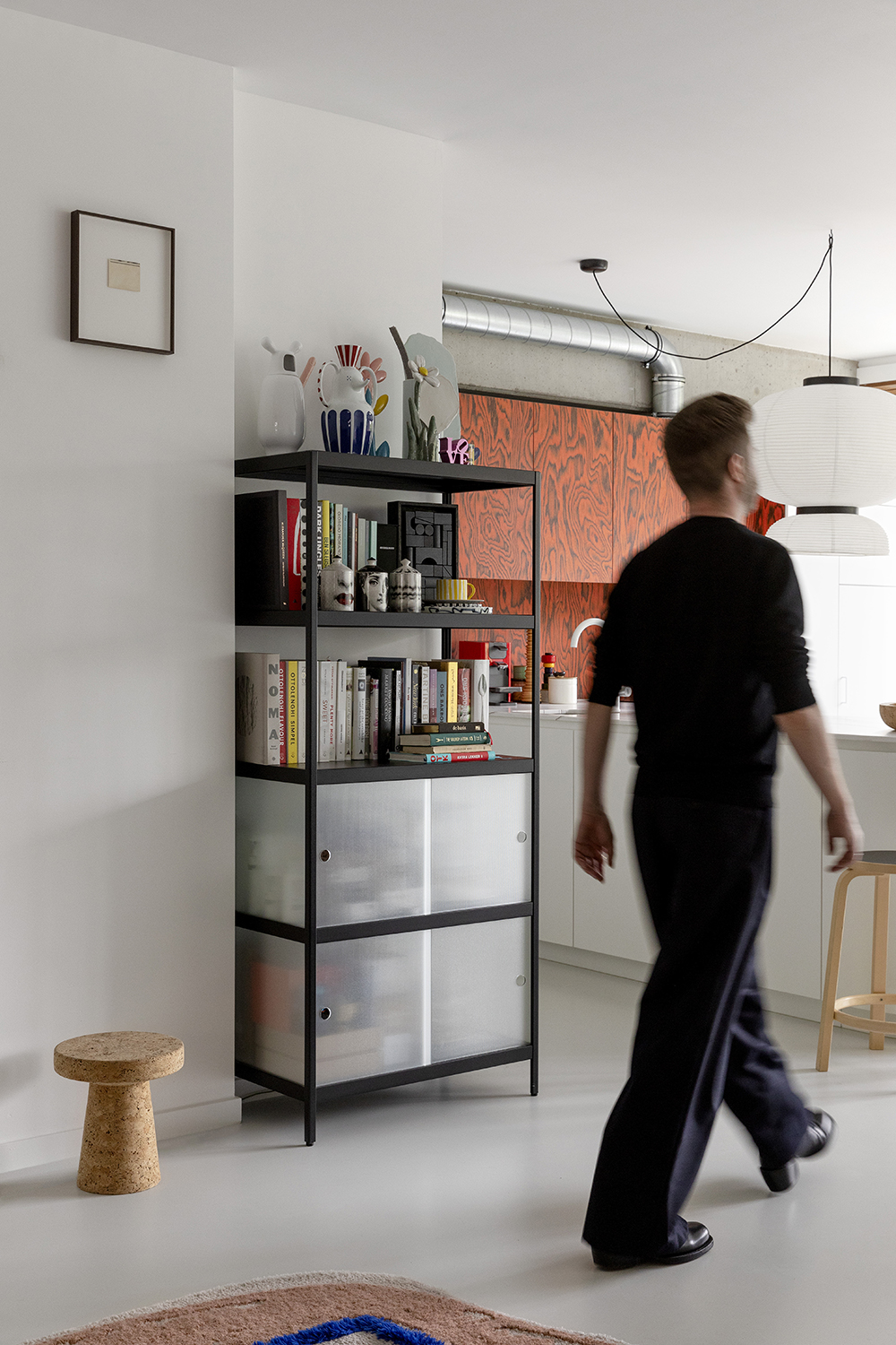
The sleek black aluminium frame contrasts beautifully with the ordered ... of books and accessories. At the same time, the glass doors conceal just enough to keep things interesting. You have colour and texture without looking cluttered.
But of course, it's not just about looks. When choosing storage furniture, practicality also plays an important role. The alcove in which the cabinet stands is quite narrow so other cabinets simply did not fit.
.jpg)
"The size of the MIST cabinet happened to fit perfectly, so the choice was quickly made. The cabinet also hides the thermostat and switches, an extra convenient coincidence." And so we do end up with that eye for detail and aesthetics again.
Dieter Van Den Storm
Artistic Director of MAD, Brussels
Ward Verbakel
Architect and founder of PLUSoffice, Brussels

The large windows on both sides allow for plenty of daylight and provide a surprisingly green view:
"We overlook the trees of a petting zoo. Unexpected in this neighbourhood, but an added bonus: it sometimes feels like we escape the city altogether. We experience all the seasons up close."
What works well, you don't need to change. The couple recently refreshed their interiors, but the basic design remained intact. The floor was renewed, the walls got a fresh coat of paint, and the kitchen received a radical makeover. Where they used to have a simple white kitchen, they now cook in a bold composition of red fronts in Sottsass veneer, a rounded countertop and a beautiful marble worktop. A striking curtain by Christoph Hefti completes the look.
"Contemporary design doesn't have to be sleek and boring. You can really make a difference with colourful accents and atypical materials."
That impact can be found throughout the flat. From Jaime Hayon's royal blue wardrobe to Vitra's yellow sofa: striking pieces that go surprisingly well together.
"We choose our things based on our gut feeling, out of love for a particular object. Whether it's a large piece of furniture or a small accessory, it's about the story behind it, the vision of a brand or the designer's hand - these are the things that make an item special for us. It doesn't have to be new or expensive, but it does have to be interesting."
The MIST cabinet in the living room is another good example of this vision. Belgian, timeless, durable, ... the design ticks all the boxes. "In my childhood home, there was a Kewlox cabinet in just about every room," says Dieter.
"The MIST is a modern interpretation of that classic look, with a sleeker design that moves with the times. It also fits perfectly into the oeuvre of the designer Julien Renault, a designer I have followed from the beginning."
.jpg)

